
Part of an ongoing series of 29Secrets stories, taking a deep dive into the history of legendary beauty products and iconic fashion moments…
By Christopher Turner
Illustration by Michael Hak
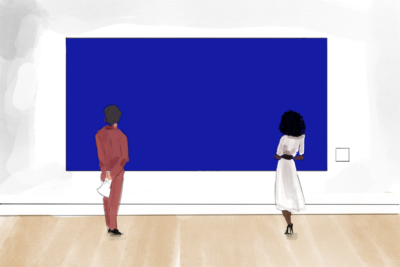
Blue is everywhere. We wear it on our bodies, paint it on our walls and scroll past it on our screens, all without giving the colour much thought. You can see it sweeping across a couture gown in Paris, hanging on the wall of one of the world’s great art galleries or stitched into a hoodie at your local H&M. Yet for most of human history, a deep, brilliant and lasting blue was remarkably difficult to possess. You could look up and see it filling the sky or stare out across the sea, but neither of those could be ground into powder and brushed onto a wall. Plants could produce blue dyes for textiles, and artists had access to other blue pigments, but the intense, luminous blue they coveted was considerably harder to come by.
For that, they needed lapis lazuli, a semi-precious stone prized for thousands of years whose finest deposits came from the mountains of Badakhshan, in what is now northeastern Afghanistan. From that stone came a pigment so beautiful, so difficult to produce and so valuable that, at its finest, it could cost more than its weight in gold. Artists rationed it, patrons specified it in contracts and painters often reserved their supplies for subjects considered worthy of the expense: the robes of the Virgin Mary, sacred figures and visions of heaven.
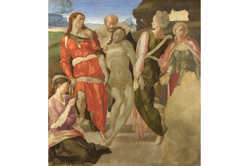
The colour was so valuable that it may even help explain a curious detail in one of art history’s famous unfinished paintings. Michelangelo’s The Entombment, painted around 1500–01 and now hanging in London’s National Gallery, contains a conspicuous blank area where the kneeling Virgin Mary was probably intended to appear. The gallery notes that Michelangelo would have needed costly ultramarine to complete Mary’s traditional blue mantle, and may have been waiting until late in the painting process to add it. We know that Michelangelo ultimately abandoned the work when he returned to Florence, where he would soon begin carving the block of marble that became David, so a shortage of blue wasn’t necessarily what doomed The Entombment. Still, the possibility that obtaining a colour could influence when even Michelangelo completed part of a painting tells us something remarkable about the world in which he worked.
That colour was ultramarine. And for centuries, people kept chasing it.
A blue born from stone
Lapis lazuli is difficult to mistake for an ordinary rock. At its best, it is an almost hypnotic deep blue, frequently streaked with white calcite and dotted with metallic-looking flecks of pyrite, so that a polished piece can resemble a tiny night sky. Human beings were captivated by it long before Renaissance painters began turning it into paint. Lapis travelled enormous distances in the ancient world, appearing in Mesopotamia thousands of years ago and in ancient Egypt, where it was prized for jewellery, amulets and ornamentation. Its presence so far from the mountains where it originated tells us something important: long before modern transportation, people were willing to move this beautiful blue stone across vast stretches of the known world.
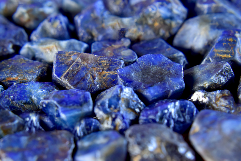
But lapis lazuli and ultramarine are not exactly the same thing. Lapis is the rock, while lazurite is the blue mineral within it, and ultramarine is the pigment painstakingly extracted from that mineral. Simply taking a beautiful piece of lapis and grinding it into powder does not necessarily produce a beautiful blue, because the stone also contains other minerals, including pale calcite and glittering pyrite. Crush everything together and those impurities can leave you with a disappointing greyish-blue powder rather than the intense colour painters desired.
Getting the good stuff required considerably more work. By the late Middle Ages, craftspeople had developed an elaborate method for extracting the finest blue particles: crushing and grinding the stone before working the resulting powder into a sticky mixture containing ingredients such as wax, resin and oils. This dough-like mass could then be kneaded in a liquid solution, gradually releasing the blue particles while leaving much of the unwanted material behind. Even then, not all ultramarine was created equal: the first extraction produced the richest and most intensely coloured pigment, while subsequent extractions yielded progressively paler grades. It was a laborious and inefficient process, but it was also the secret behind one of the most breathtaking colours artists had ever seen.
Around the turn of the 15th century, Italian painter and writer Cennino Cennini described ultramarine in Il Libro dell’Arte, his influential handbook on the practical business of making art. Cennini wrote about everything from preparing brushes and panels to mixing pigments, but when he reached ultramarine his language became almost reverential, describing it as a colour “illustrious, beautiful, and most perfect, beyond all other colours.” For a man who spent his life thinking about colour, there was simply nothing else quite like it.
From “Beyond The Sea”
Even the name ultramarine contains a clue to the journey the pigment had to make before it reached a European painter’s palette. The word comes from the Medieval Latin ultramarinus, meaning “beyond the sea,” and the name wasn’t originally a poetic description of the colour so much as a reference to where the material came from. For Europeans, lapis lazuli arrived from somewhere distant, transported west through complicated networks of merchants and trading routes before crossing the Mediterranean into European markets, with Venice and its powerful commercial connections to the East becoming an important gateway.
Before a Renaissance artist could place a streak of brilliant ultramarine onto a panel in Florence, Venice or Rome, the stone required to make it had already completed an astonishing journey. It had been extracted from mountains in Central Asia, transported thousands of kilometres through the hands of traders and merchants, carried into Europe, purchased, and then crushed, ground and finally subjected to an elaborate purification process. By the time the finest ultramarine reached an artist’s brush, it wasn’t simply paint; it was an international luxury commodity.
And people knew exactly what it was worth. Wealthy patrons commissioning paintings sometimes specified ultramarine in contracts and even dictated the quality that was to be used. A 1437 contract for an altarpiece by the Italian painter Sassetta, for example, called for gold and the “best ultramarine.” Even more revealing is a 1515 contract for Andrea del Sarto’s Madonna of the Harpies, which stipulated that at least five gold florins were to be spent specifically on the ultramarine used for the Virgin Mary. Today, we tend to think of the value of a painting as belonging to the finished artwork, but in Renaissance Europe the ingredients themselves could represent a considerable portion of the commission. To contemporary viewers, a generous expanse of the finest blue wasn’t simply beautiful; it was evidence that somebody had paid dearly for it.
Ultramarine wasn’t simply blue. It was money on the wall.
The Virgin Mary’s blue
No figure became more closely associated with this coveted colour than the Virgin Mary. Look through centuries of European religious art and you will repeatedly find Christ’s mother enveloped in blue, an association so familiar that today we may barely register it; Mary wears blue because, in our visual imagination, Mary simply wears blue. But that tradition developed over time, and the material chosen to create those robes could carry a meaning of its own.
Using ultramarine for the Virgin could simultaneously function as an artistic choice, an act of devotion and a visual declaration of her exalted status. There is also something wonderfully poetic about where that blue came from. A colour that came to evoke the heavens was not taken from the sky, but dug from the earth. Stone was pulled from distant mountains, carried across continents, ground into powder and painstakingly purified so an artist could use it to paint the Queen of Heaven. The spiritual and the material became inseparable, and because contemporary viewers understood the value of what they were seeing, a sweeping ultramarine robe communicated something that a reproduction on a screen can’t entirely capture.
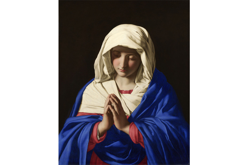
It is worth imagining what encountering such a blue might have meant in a world without electric screens, industrial dyes and thousands of mass-produced colours competing for attention. An expanse of intense ultramarine glowing beside gilded details in a church or illuminated manuscript was not simply another shade among countless others. Its rarity, brilliance and the sheer effort required to create it were part of the experience. The colour announced that what you were looking at mattered.
When blue became a status symbol
Inevitably, a colour that carried that kind of value also became a marker of status beyond religious imagery. In secular paintings, lavish amounts of ultramarine could make wealth visible without the need for piles of coins or obvious displays of jewellery. In that sense, the colour could function as a kind of early conspicuous consumption. Just as a couture gown, rare watch or coveted handbag can communicate status today, an expensive pigment could say something about both the person depicted and the patron who could afford to have them painted.
For artists, meanwhile, using ultramarine required calculation. Less expensive blues could be substituted in areas of lesser importance, while the finest pigment might be reserved for a focal point or supplied separately by the patron. Artistic decisions and financial decisions could therefore be inseparable. Few artists, however, used ultramarine as unexpectedly—or as lavishly—as Johannes Vermeer.
Vermeer’s obsession with blue
Vermeer’s paintings are famously quiet. Women read letters, pour milk, make music or simply stand beside windows while daylight enters a room; there are no enormous battle scenes or crowded mythological spectacles. Yet beneath that apparent simplicity was an artist with an extraordinarily sophisticated understanding of colour and a remarkable fondness for ultramarine. More intriguingly, he didn’t reserve the pigment for things that were obviously blue. Technical examinations have revealed ultramarine mixed into shadows and other colours, subtly altering their temperature and luminosity, meaning blue could be hiding inside a wall, a piece of fabric or a shadow without the viewer consciously realizing it was there.
The most famous example, however, is unmistakably blue. Painted around 1665, Girl with a Pearl Earringfeatures a young woman turning toward the viewer, an oversized pearl at her ear and a blue-and-yellow headscarf wrapped around her head. Modern analysis has revealed high-quality natural ultramarine made from lapis lazuli in the scarf, giving the small painting an unexpected geography: a stone mined in what is now Afghanistan travelled thousands of kilometres before eventually becoming the brilliant blue wrapped around the head of a mysterious young woman painted in the Dutch Republic.
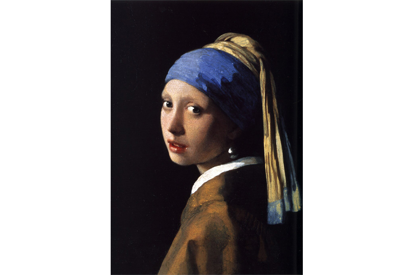
Vermeer’s fondness for ultramarine becomes even more intriguing when we consider that he was not an especially prolific painter and that his family faced serious financial difficulties after his death. Exactly how he was able to use such an expensive material so freely has long invited speculation; perhaps a patron helped supply it, or perhaps Vermeer simply considered its visual possibilities worth the expense. What his paintings make clear is that ultramarine no longer had to announce itself through a vast blue robe. In Vermeer’s hands, it could quietly change the atmosphere of an entire room.
The race to recreate ultramarine
For centuries, there was no easy way around the problem—if you wanted natural ultramarine, you needed lapis lazuli. But by the early 19th century, advances in chemistry and manufacturing were beginning to transform the way colours were produced. Scientists and manufacturers increasingly sought reliable synthetic alternatives to costly natural pigments, and ultramarine represented an irresistible challenge: reproduce that legendary blue without importing and painstakingly processing semi-precious stone, and one of art’s great luxuries could suddenly become available to a vastly larger market.
In 1824, France’s Société d’Encouragement pour l’Industrie Nationale offered a prize of 6,000 francs to anyone who could develop an economical industrial method of producing artificial ultramarine. French chemist Jean-Baptiste Guimet developed a successful process, while German chemist Christian Gottlob Gmelin independently arrived at one around the same period. In 1828, Guimet was awarded the French prize, and the pigment that became known as French ultramarine represented a genuine turning point in the history of colour.
The difference was not merely theoretical. Historical research places natural ultramarine around Guimet’s era at roughly 13 times the price of his early synthetic version, and as industrial production expanded during the 19th century, that gap grew even wider. Suddenly, manufacturers could create on a large scale a pigment remarkably similar to one that had previously required an elaborate chain stretching from Afghan mountains to European artists’ workshops. A colour once negotiated in contracts and carefully rationed across paintings was moving within reach of ordinary artists and consumers.
Ultramarine had been democratized.
Blue for everyone
Becoming cheaper did not make ultramarine less important; instead, freedom from its enormous price tag allowed the pigment to escape the rarefied world in which it had spent centuries. Artists could use it more liberally and manufacturers could produce it in quantities that would once have been unimaginable, while synthetic ultramarine increasingly appeared in manufactured goods and household products. Perhaps the most wonderfully mundane example was laundry bluing, where small quantities of blue were used to counteract the yellowish cast of aging white fabric, making whites appear brighter.
It is difficult to imagine a more dramatic reversal of fortune. A colour once transported across continents and reserved for some of Christianity’s most sacred figures had eventually found its way into the washtub. Yet becoming commonplace did not entirely erase ultramarine’s ability to inspire obsession, and in the 20th century one French artist would take that obsession further than almost anyone before him.
What if blue was the entire point?
Yves Klein didn’t simply want to paint something blue—he wanted to paint blue itself.
Born in Nice in 1928, Klein became fascinated with the possibility that colour could exist independently of the objects artists traditionally used it to depict. Why should blue have to become a dress, a sky, an ocean or the Virgin Mary’s robe? What if the colour itself was enough? Klein was particularly captivated by ultramarine pigment in its raw, powdered state, but conventional paint presented a problem: once the pigment was mixed with traditional binders, some of its astonishing intensity could disappear, leaving the blue darker or flatter and robbing it of the velvety quality he loved.
Working with Parisian paint dealer Édouard Adam, Klein found a way of combining ultramarine pigment with a synthetic resin binder that helped preserve the appearance of the dry pigment. The result became known as International Klein Blue, or IKB. On May 19, 1960, Klein registered the process in France using a Soleau envelope. Contrary to the frequently repeated story that Klein patented his particular shade of blue, he did not own the colour itself; what he registered was the technical process used to achieve its distinctive appearance.
Stand in front of one of Klein’s blue monochromes and the intensity can appear almost unreal, something reproductions struggle to communicate. There seems to be nowhere for the eye to settle; instead of behaving like ordinary paint sitting on a canvas, the blue can appear strangely limitless, as though the surface might continue indefinitely. Beginning in the 1950s, Klein created monochrome works in which there was no conventional subject at all—no portrait, no landscape, no Virgin and no heaven.
Just blue.
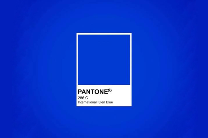
After centuries in which artists had spent fortunes obtaining ultramarine so they could use it to represent something precious, Klein turned the entire equation around: the blue itself became precious. In a way, it was the logical conclusion to a story that had begun thousands of years earlier in the mountains of Central Asia. Humanity had carried this colour across continents, ground stones to obtain it, associated it with divinity, reproduced it through chemistry and used it to transform some of the most celebrated paintings in Western art. Klein simply asked us to stop looking through the colour and finally look directly at it.
The blue we stopped noticing
Today, we don’t have to chase ultramarine, because the visual world it helped create has become familiar to us. Intense, saturated blues appear everywhere, from museum walls and fashion runways to cosmetics, advertising, furniture and clothing. A shade that once communicated extraordinary rarity can now sweep across a couture gown in Paris while a strikingly similar blue appears on a hoodie hanging from a rack at your local H&M. The comparison isn’t about those objects necessarily containing ultramarine pigment; it is about how thoroughly the once-astonishing sight of brilliant blue has entered everyday life.
Its very familiarity makes it difficult to imagine a time when colour itself could be a luxury. Before modern chemistry gave us an enormous range of reliable and inexpensive pigments, colours carried entire histories within them. They came from particular stones, soils, plants, insects and metals; some were poisonous, some faded, some travelled across oceans and some cost fortunes. Few travelled farther, literally or symbolically, than ultramarine.
Perhaps the strangest part of ultramarine’s history is that the colour never really lost its power; what changed was our access to it. People spent centuries—and fortunes—chasing the perfect blue and, eventually, we caught it.
Now that it’s everywhere, most of us have stopped noticing just how extraordinary it really is.
Want more? You can read other stories from our The Story Of series right here.
Trending
 10 Memorable Images Of Supermodel Gia Carangi (1960–1986)
 The ELIE SAAB X H&M Collection Includes The Most Romantic Bridal Look
 THE STORY OF: Madonna’s Iconic Jean Paul Gaultier Cone Bra
 20 Actors You Probably Forgot Appeared On ‘Gilmore Girls’
 20 Celebrities Who Posed For Abercrombie & Fitch Before They Were Famous