
 Style
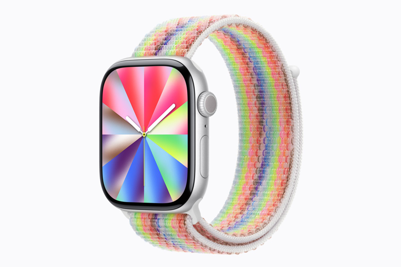
Style
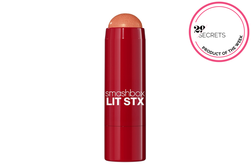
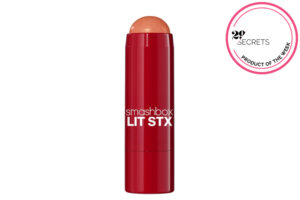
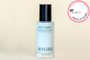
Why juggle blush and highlighter when one creamy stick can do both? This limited-edition multitasker delivers buildable colour, a luminous glow and an effortlessly fresh finish in a…
Continue Reading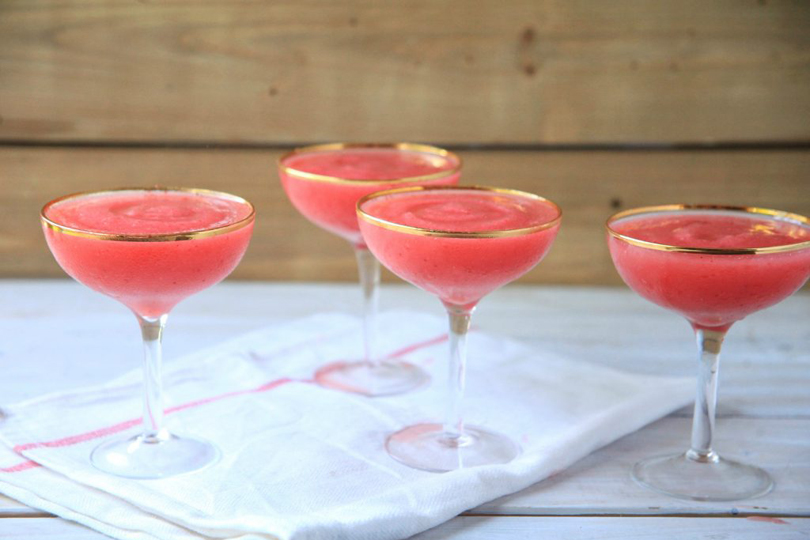
A bottle of rosé, frozen strawberries and a blender are all you need to create the easiest crowd-pleasing cocktail of the summer.
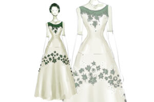
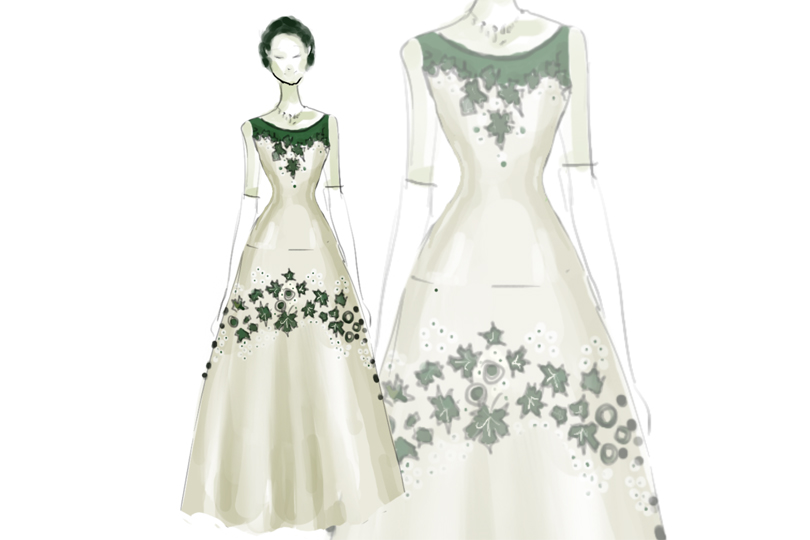
Continue ReadingCreated for a state banquet in 1957, Queen Elizabeth II’s “Maple Leaf of Canada” gown quietly transformed fashion into diplomacy—embedding one of the country’s most enduring symbols into…
Continue Reading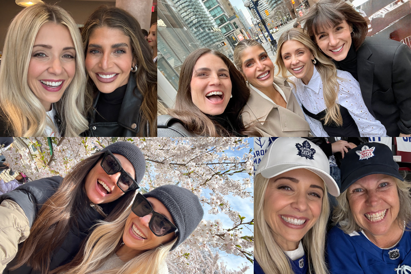
In a season of endless demands and competing priorities, 29Secrets columnist Danielle Graham makes the case for investing in the friendships that make life richer, lighter and infinitely…
Continue Reading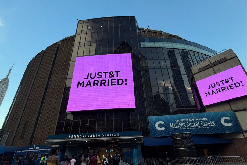
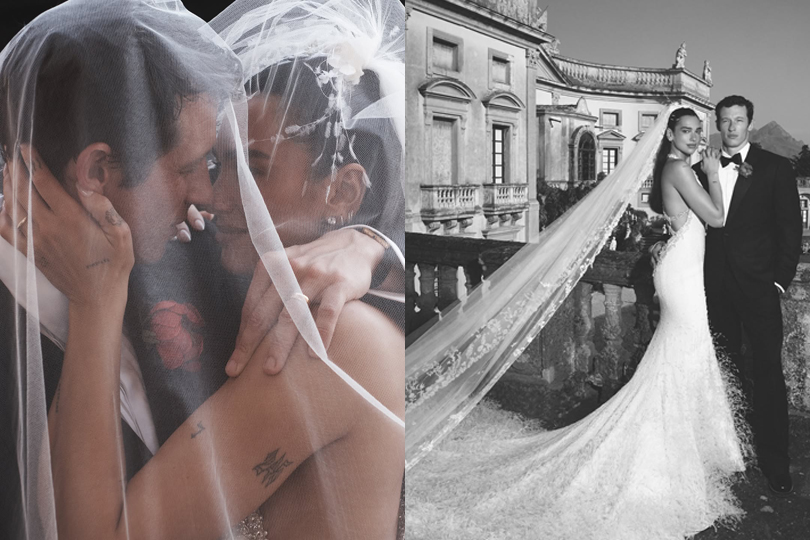
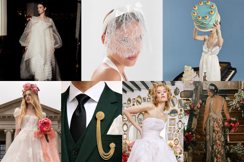
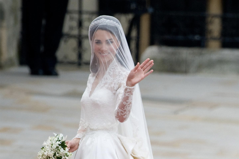
Taylor and Travis tied the knot in New York on Friday, after months of speculation about when, where and how it would happen. This wedding was absolutely a…
Continue ReadingCreated for a state banquet in 1957, Queen Elizabeth II’s “Maple Leaf of Canada” gown quietly transformed fashion into diplomacy—embedding one of the country’s most enduring symbols into…
Continue Reading