Part of an ongoing series of 29Secrets stories, taking a deep dive into the history of legendary beauty products and iconic fashion moments…
By Christopher Turner
Illustration by Michael Hak
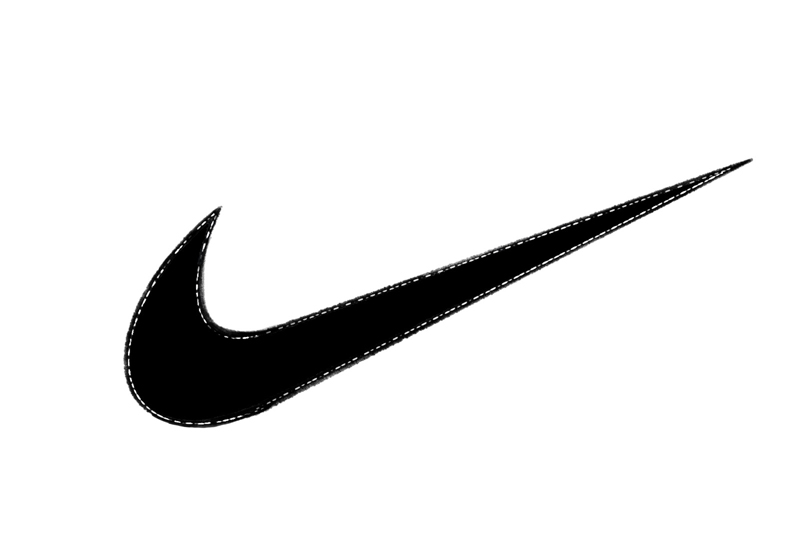
Few logos are as instantly recognizable – or as emotionally charged – as the iconic Nike Swoosh logo. Simple yet kinetic, it’s more than a corporate emblem that can be found on sneakers, hats and hoodies; it instantly represents movement, aspiration and cultural dominance. The Nike Swoosh logo appears on the podium when Olympians clutch gold medals, on the feet of teenagers playing basketball, and on high-fashion runways in New York, London, Milan and Paris. It’s been stitched in a thousand colours, spray-painted on walls, tattooed on arms, and reinterpreted over and over again by artists and designers across the globe. Not too bad for something that started as a freelance design project taken on for $35 by a Portland State University student.
It’s true. What started as a $35 design project has become one of the most valuable and versatile icons in modern history – a symbol of both personal grit and global influence.
Yet for all its ubiquity, the Swoosh’s origin story is surprisingly humble. Behind this mark lies a fascinating history of scrappy beginnings, a bit of serendipity, and a young designer whose quick sketch captured a movement far bigger than she could imagine. Read on for the full story of how the Nike Swoosh logo came to be, how it grew into a global mark of ambition, and why it continues to shape culture half a century later.
From Blue Ribbon Sports to Nike: a startup with running shoes and big dreams
The Nike story begins back on January 25, 1964, when University of Oregon track coach Bill Bowerman and his former student track athlete Phil Knight founded “Blue Ribbon Sports” to distribute Onitsuka Tiger running shoes from Japan. The duo were entrepreneurial but hardly corporate titans: Knight famously sold Onitsuka signature sneakers out of the trunk of his car at track meets across Eugene, Oregon.
In its first year in business, Blue Ribbon Sports sold 1,300 pairs of the popular Japanese running shoes, grossing around $8,000. By 1965, Blue Ribbon Sports’ sales had reached $20,000.
By 1971, the Blue Ribbon Sports partnership with Onitsuka (known today as Asics) was ending, and Knight knew that in order to survive, his young company would need a new name and its own shoe line. Knight created cleated shoes for football or soccer, and found a factory in Mexico ready to make the shoes, while simultaneously relaunching the company under a new name. And so, on May 30, 1971, Bowerman and Knight’s Blue Ribbon Sports officially became Nike Inc.
The name “Nike,” originally suggested by employee Jeff Johnson, fit perfectly with the athletic spirit that Bowerman and Knight wanted to promote when their cleated shoes were ready for the shelves: Nike is the winged goddess of victory in Greek mythology, who sat at the side of Zeus in Olympus. But a new name wasn’t enough. Knight needed a “stripe” – the industry term for a graphic symbol that stands as a shoe logo – to go with his soon-to-be-launched brand. And it needed to be catchy enough to stand toe-to-toe with Adidas’ three stripes or Puma’s leaping cat.

Enter Carolyn Davidson: a design student on a budget
Interestingly, Knight’s search for a logo designer didn’t lead him to a big design agency…it led him to the halls of Portland State University in Oregon, where he was teaching accounting. One of the students, Carolyn Davidson, was a 28-year-old graphic design major who needed some extra money. Davidson had started as a journalism major but switched to design after taking a design course to “fill an empty elective.”
Knight had overheard that Davidson was looking to make some extra money so she could take oil painting classes with a friend, so he offered her $2 an hour (equivalent to around $16 per hour in 2025) to develop a “stripe” for his new line of footwear. He asked Davidson to make sure the stripe conveyed motion and did not look similar to the three stripes of Adidas. Over the ensuing weeks, Davidson created several different logos and gathered them together to present to Knight, Bob Woodell and Jeff Johnson (two other company executives) at the company’s home office, which at the time was located in Tigard, Oregon.
Davidson’s sketches included ones with interlocking shapes, jagged patterns and blocky typography. But one stood out: a fluid, curved checkmark-like shape that conveyed both speed and uplift. Davidson would later say that she was thinking of the wings of Nike, the goddess, as she drew it.
“I mocked up designs on tissue paper and held them up to shoes,” Davidson recalled, as told to Darren Rovell of ESPN in 2016. “I gave him five choices for a meeting they had. I wasn’t overly pleased with what I did, but I liked the swoosh the best.”
When Davidson presented her work, Knight’s response was muted. “I don’t love it,” he reportedly said, “but it will grow on me.” With production deadlines looming, he selected the Swoosh and cut Davidson a $35 check – roughly $280 in today’s money – for the 17.5 hours she had worked on creating the Swoosh and other attempts.
“I had no idea how much to charge him for my work,” Davidson recalled to ESPN. “I had taken design classes, but I didn’t know anything about the business. So I charged $35.”
Davidson says she did ask for more time to refine the work that she had done on the Swoosh, but Knight said the company had tight production deadlines to meet and needed the logo as soon as possible. So the hand-drawn logo was flown off to Guadalajara, Mexico, to set manufacturing in motion.
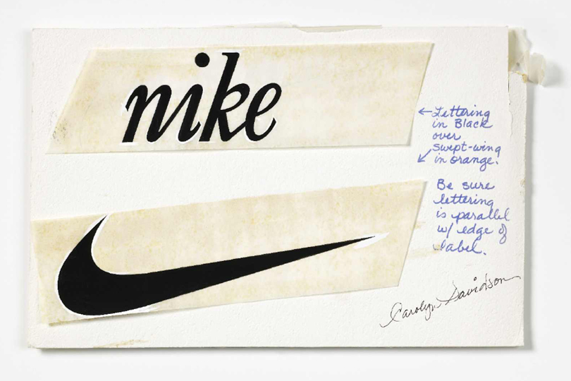
Nike’s Swoosh logo was officially trademarked on June 18, 1971, and a year later, in June 1972, the company released its first track shoe to sport the new Swoosh, the Nike Cortez, at the U.S. Track and Field Olympic Trials in Eugene, Oregon.
Davidson continued to take care of all of the design demands of the growing company by herself until the work exceeded one person’s capacity. In 1976, Nike hired its first external advertising agency, John Brown & Partners, and Davidson, who went on to be known as “The Logo Lady,” went on to work on other clients’ needs.
The design: More than just a checkmark
Though often mistaken as simply a checkmark, the Nike Swoosh logo is more nuanced. Its thicker trailing edge and pointed leading tip evoke both motion and power, while the upward angle implies speed and aspiration. Even the name Swoosh, which was originally coined internally by Nike employees, captures the sound of something moving fast.
Initially, the Swoosh appeared alongside the word “Nike” in block letters, usually on the sides of running shoes like the Nike Cortez. Over time, as the brand gained confidence, the text was dropped and the Swoosh became a standalone mark. This was a bold decision in the conservative world of 1970s corporate branding, where most companies clung to wordmarks.
Brand and logo evolution in the 1980s: The Jordan effect
By the time Nike signed Michael Jordan in 1984, the Swoosh had already begun to morph from a sportswear logo into a symbol of global pop culture. The Air Jordan I, released in April 1985, prominently featured the Swoosh alongside a new “Wings” logo. This pairing gave the Swoosh exposure to a generation of basketball fans and helped cement Nike’s reputation as the brand of rising stars.
The 1988 “Just Do It” ad campaign completed the brand’s transformation and wove the brand, its logos and slogans into society’s collective consciousness. The “Just Do It” slogan was dreamed up by Dan Wieden, the head of ad agency Wieden+Kennedy, who admitted that it was actually inspired by the final words of murderer Gary Gilmore, who killed two people in Utah in 1976. As Gilmore was the first person in the United States executed since the reinstatement of the death penalty in 1976, his story had immense cultural resonance at the time. When Gilmore reached the end of death row on January 17, 1977, he was asked if he had any last words. Facing down a five-man firing squad, Gilmore said: “Let’s do it.”

“I like the ‘do it’ part of it,” Wieden told filmmaker Doug Pray in the 2009 documentary Art & Copy.
“None of us really paid that much attention,” Wieden recalled of the team working on the Nike ad with the now iconic slogan. “We thought, ‘Yeah. That’d work.’”
As one would expect, Nike’s former marketing chief, Liz Dolan, told Pray in the same 2009 documentary that Nike tries not to widely share the origins of that particular phrase.
Still, the “Just Do It” slogan distilled Nike’s ethos into three words. Placed next to the Swoosh logo in ads featuring everyone from marathoners to weekend joggers, it created a perfect pairing of message and mark.
The Swoosh as a cultural passport in the 1990s
By the early 1990s, Nike’s marketing had moved beyond sports into lifestyle. Hip-hop artists, skateboarders and street-style pioneers adopted Nike gear, elevating the logo into a badge of cool. In cities from New York to Tokyo to Toronto, the Swoosh became shorthand for belonging to a global youth culture.
This was also the decade of Nike’s boldest design experiments. Shoes like the Air Max 95 and the Foamposite used oversized or remixed Swooshes. Nike apparel featured all-over prints of the now iconic mark. These moves signalled that the Swoosh was flexible enough to be both minimalist and maximalist – one reason it continues to thrive in today’s remix culture.
The Swoosh in the new millennium: collaborations and high fashion
As Nike entered the 2000s, it began to actively court the worlds of art and high fashion. The Swoosh appeared in collaborations with designers like Hiroshi Fujiwara, Comme des Garçons and, most famously, the late American designer Virgil Abloh’s innovative brand Off-White, which famously blended streetwear with high fashion. Abloh’s highly coveted “The Ten” collection, which kicked off in August 2017, deconstructed Nike classics, most importantly exaggerating the Swoosh with visible stitching and dramatic placements. These designs turned the logo itself into a focal point, proving its elasticity after decades in the market.
Other memorable Swoosh moments from the decade? Also in 2017, Nike unveiled a “Pro Hijab” for female Muslim athletes, adorned with a discreet Swoosh, and in 2018, it launched an ad campaign featuring American footballer and civil rights activist Colin Kaepernick, using the Swoosh as a backdrop for a statement about social justice. Both moves signalled that Nike saw its logo not just as a sales driver but as a platform for cultural discourse.

Carolyn Davidson’s recognition and reward
Now, back to Carolyn Davidson – the woman behind the logo.
Nike didn’t forget Davidson or the Swoosh logo’s humble beginnings. In 1983, Bob Woodell, who was Nike president at the time, called Davidson and invited her to have lunch with him and Knight.
“When I showed up, all these employees were there,” Davidson recalled to ESPN. “They had a spread of food and chocolate swooshes for dessert. They gave me a gold ring in the shape of a swoosh with a diamond in it, and some shares of stock.”

The number of shares that Davidson was given has never been disclosed publicly, but it was reportedly, and deservedly, very generous.
“I haven’t cashed in a single share of the original stock, but the shares have split a bunch of times and I have sold some of that stock,” Davidson said.
After that, Davidson retired from graphic design, living quietly in Oregon as the logo she created became one of the most recognized symbols on the planet.
“I’ve pretty much stayed under the radar, and nobody knows who I am,” Davidson told NPR in 2011. “When I see it on TV – and I turn on a game and both teams are in Nike, I mean, I just get a good feeling. Or if I turn a corner and run into a billboard, or if I watch the Olympics – I mean, it’s just a good feeling inside.”
A global language of sport and style
Today, the Swoosh is recognized by an estimated approximately 97 per cent of people living in North America, according to marketing surveys, and enjoys similar recognition abroad. It’s one of the few corporate marks that transcends language barriers.
Of course, no icon escapes scrutiny. In the 1990s, Nike faced boycotts over working conditions in overseas factories. Protesters often used the Swoosh in parody logos, adding frowns or dollar signs to critique the company. Yet the logo’s endurance through these storms underscores its power. Even in parody, the Swoosh remained recognizable – arguably proof of its design strength.

There’s no denying that the future is strong for the Swoosh. As Nike leans into digital fashion, sustainability and the metaverse, the Swoosh remains its anchor. Expect to see it rendered as a hologram in augmented-reality workouts, stitched into sneakers made from recycled materials, and licensed as an NFT skin (or design) in video games. More than 50 years on, it’s still moving forward.
That’s the power of a logo done right.
Want more? You can read other stories from our The Story Of series right here.

