I know that you’re looking outside right now and thinking, “Why?” I know that despite it being February, you still thought we’d avoid the inevitable cold snap that dictates Canadian winter. I know that you thought maybe this is it; that maybe winters are just like this now.
Well, you were wrong. It is cold and it is February and I am thinking about fall.
Granted, I am always thinking about fall. But considering New York Fashion Week is upon us, all I can currently think about is how excited I am for the end of summer when I can plan and plot accordingly, knowing that we get way more use out of our fall and winter wardrobes than we ever have summer and spring. (And you know I’m right, summer-lovers, so don’t even try.)
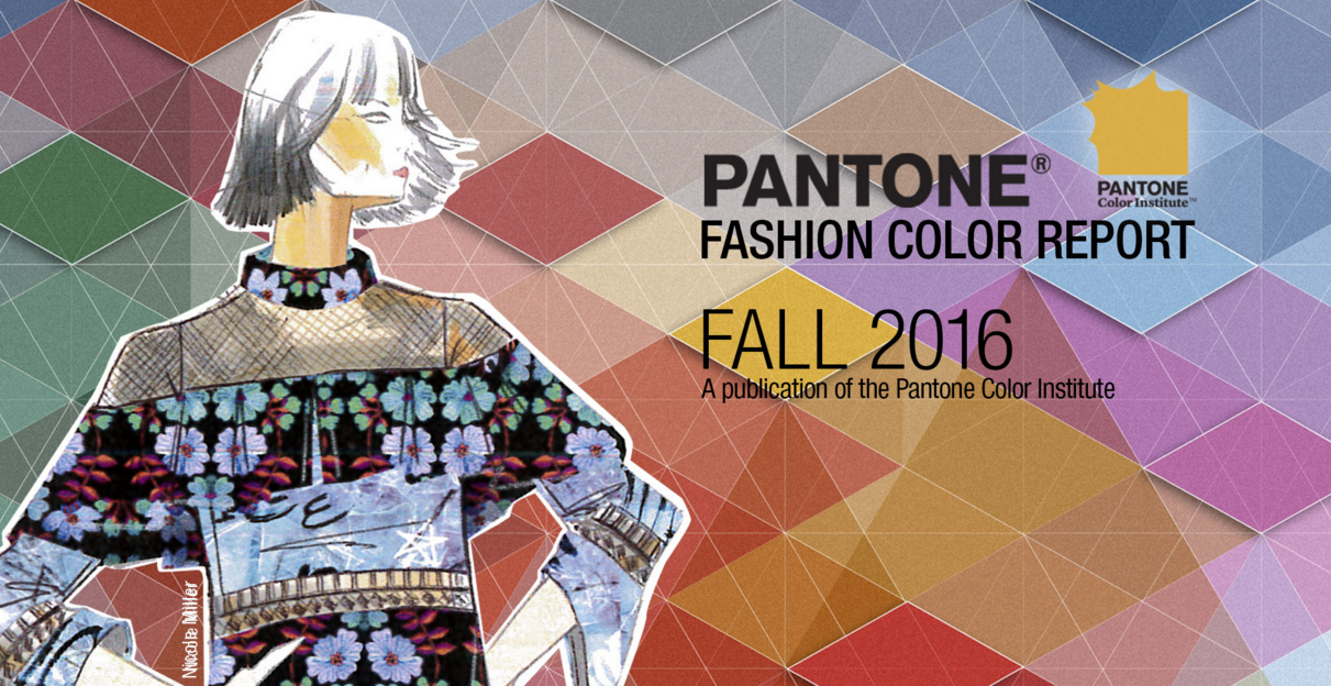
But I’m especially on #TeamFall today, now that Pantone’s released its list of the top 10 colours of the F/W 2016 season.
According to WWD, Pantone Color Institute’s Leatrice Eiseman has explained the year’s muted, calming, neutral tones are in response to the madness currently dictating the cultural landscape.
“With all the angst that’s out there in the ether and in the world around us, there is a need for more calming colours,” she explained.
So what are they?
1. Riverside (think, “starry night” blue)
2. Spicy Mustard (self-explanatory)
3. Airy Blue (or, “sky blue” if you are basic like me)
4. Warm Taupe (“They say taupe is very calming.” – Brad Pitt, Ocean’s Eleven)
5. Bodacious (fuchsia, but with a little purple tossed into the mix)
6. Sharkskin (bright pink) (JK — it’s grey, like a shark)
7. Potter’s Clay (scene from Ghost not included)
8. Aurora Red (or, “deep red”)
9. Dusty Cedar (sure!)
10. Lush Meadow (like a beautiful Irish field)
Eiseman went on to say that this is the year the lines between gender-centric colour tones have finally begun to blur as well, so 2016 is looking to be monumental for all types of reasons.
“It’s almost as though its time has come,” she said. “There has been such an erosion between the sexes. Fashion doesn’t have to be male or female. This whole idea is reflected in the relevance of colours in that men are feeling more comfortable in nontraditional colours and women are more open to what used to be masculine colours.”
Damn right. So pay attention to the F/W 2016 shows, my friends — we’re about to see the above colours showcased in new light.